PRESERVATION COVE
KITCHEN/DINING


MUD ROOM ADDITION


MASTER BATH
The clients had several goals to upgrade this home before moving in. The priorities would be to create a covered connection from the house to the detached garage and to redesign the kitchen with an open layout that featured a single level island with seating for 4, upgraded appliances, and a space for a future wine refrigerator. They also wanted a larger formal dining, a playroom for the kids, and updated finishes for the 2 bathrooms upstairs.
The master suite would also need tweaking and updating to function better for their needs. Wanting to spend the majority of their dollars on the mud room addition, major kitchen renovation and various whole house updates, the owners decided to avoid additional remodeling costs by staying within the existing footprint in the master bathroom. However, they did want a roomier shower with a bench seat and more storage since the closet was small and could not be expanded.
Last, but not least, they wanted a brighter, classic and clean overall aesthetic, with some architectural character that not only represented their transitional design style, but integrated seamlessly with the vernacular of the home so that the new spaces would not look "remodeled". The caveat would be that all of the materials needed to be cost-conscious and low-maintenance, without sacrificing style.
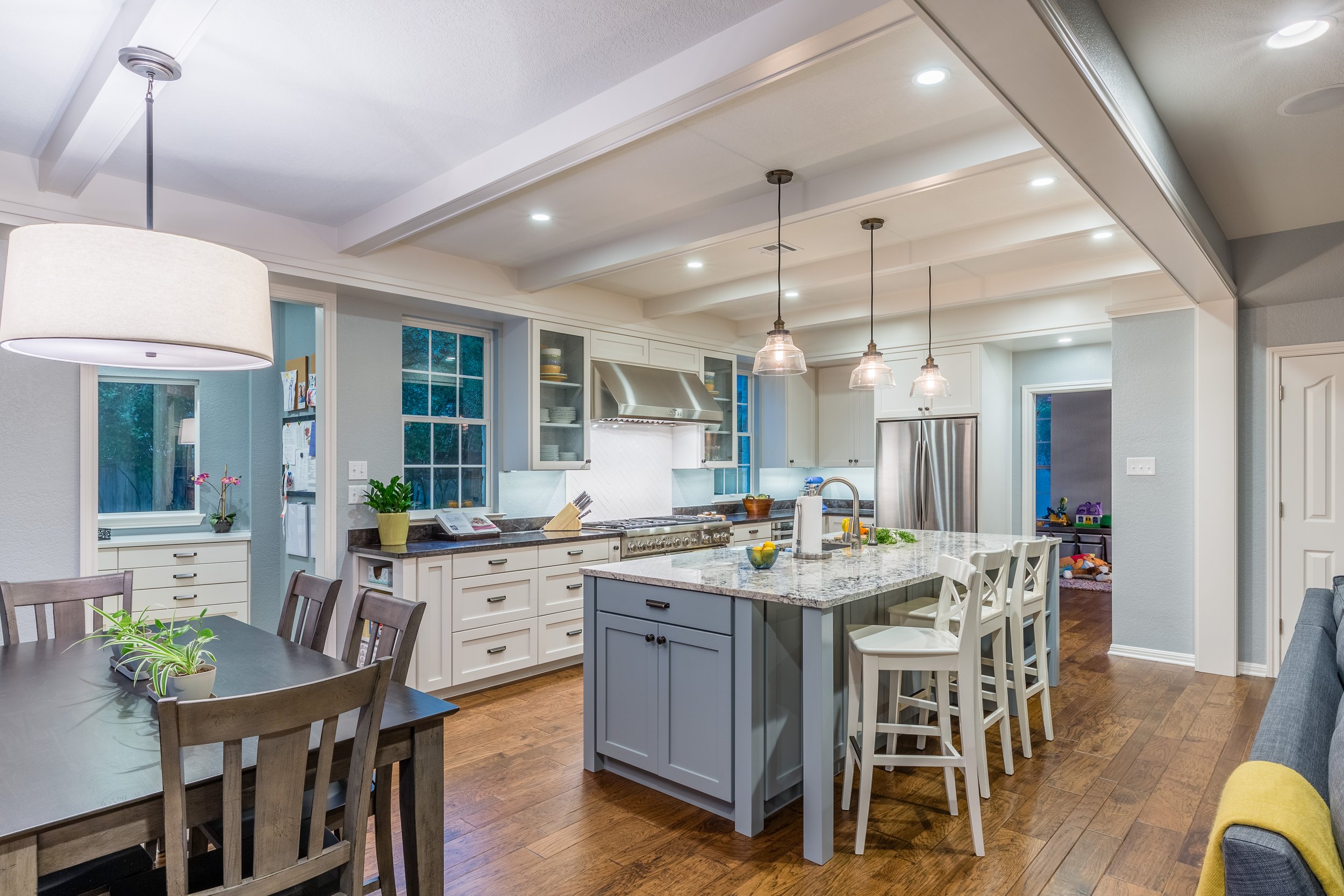
We began with a total gut of the existing G-shaped kitchen layout including the removal of structural columns, pony walls and a pantry between the kitchen and living space. A 22 foot steel beam was partially recessed into the ceiling for structural integrity. To camouflage the structural element and create an inconspicuous transition between the living space and the kitchen we designed a soffit and beam layout around the perimeter of the kitchen. The soffit was built out of millwork rather than sheetrock and finished to match the beams. The combination exudes a classic, clean look and provides a reflective finish for visual interest. The beam-and-soffit detail created an architectural feature yet offered a visual distinction between the kitchen and the living room.
The new kitchen design also exhibits a focal wall that is symmetrically balanced boasting the clean lines the clients requested for a transitional look. Cost-conscious, quality materials were specified in unique ways to replicate a more expensive look.
The mud room connector would prove to be the largest challenge in order to create a cohesive transition between the detached garage and house. With the use of BIM software we designed a connection that looked like a natural extension of the original house. We squared up an angled wall in the kitchen and dealt with a 30 degree angle between the house and the garage with a galley style connection. An abundance of windows added natural light and helped the space feel less narrow. We bridged the 18" elevation change by designing a butler's area that has steps down to the new valet cabinets on the main mud room level, and then tied all the roof lines in for a seamless exterior detail.
A new lighting plan was also implemented to enhance the overall design. LED strip lights and simple glass pendants serve as task lighting for the countertops, while 4" recessed cans with LED lamps and a linen drum shade pendant serve as ambient lighting for the kitchen and breakfast nook. In the dining room a large crystal cage chandelier mimics the scale of the room's ceiling to fill the space and provide a little drama. Simpler, square caged pendants coordinate nicely in the foyer and stair landing. Updated polished chrome vanity sconces grace the existing locations of the bathrooms while new ceiling fans are displayed in the bedrooms and common areas.
In the master bathroom our team re used as much of the existing elements as we could. We were able to salvage and reuse the mirrors, doors, millwork and the small vanity and medicine cabinet; which we simply updated with new doors and drawer fronts. We kept the layout of the closets, toilet, tub and shower in the original footprint. The glass block window would also remain and be used as inspiration for the new tile design. Also, where possible, we designed around the existing layout of the receptacles, switches and lighting junction boxes to avoid additional costs in electrical and sheet rock work.
The "hers" vanity was removed completely in order to design cabinetry that would function as both a vanity and a dresser per the owner's request. The 3-way mirror allows a single sconce to diffuse light more evenly for grooming purposes while also giving the space a glamorous appeal.
In order to comply with the clients' request for a roomier shower we removed a pony wall which granted leeway for a bench seat by way of an extension of the new tub deck. We also replaced the framed shower enclosure with a taller, frameless version. Further, we extended the new tub deck out to the original pony wall dimension which gave more depth to the shower and added a comfortable seating ledge on either side of the new under-mount tub.
The overall result is an exquisite, functional space that displays a polished sophistication without breaking the bank!


